Alerts
Alerts are used to draw the user's attention to essential information based on importance without abruptly disrupting the user's flow.
Alerts are classified into three types: those with icons, those without icons, and those with a dismissal icon. Examples of these are shown below, along with the corresponding code.
Simple Alert Bar Without Icons
This is a primary alert
This is a secondary alert
This is a signature alert
Alert With Icons
This is a success alert
This is a warning alert
This is a danger alert
Avatar
Avatars can be used to display a user's profile image or their initials in place of a picture.
Profile Avatar

Text Avatars
Badges
Badges are used to display a person's status (i.e. active, offline), to depict the quantity of items in a category, and to emphasise or draw attention to certain objects.
Status Badge
Text and Icon Badge
9
Bestseller
New
Trending
Images
The aspect ratio of the image is maintatined across all sizes, making it a responsive image. There are two types: rounded and rectangular, as shown below.
Responsive Image

Rounded Image
Cards
Cards are used to display data that is part of the same group or is related in some way. Typically used to display product information. Horizontal and vertical cards are the two variations, as shown below.
Horizontal Cards with Image and Text
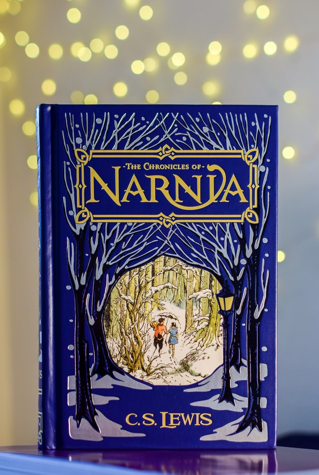
The Chronicles of Narnia
Written by C.S.Lewis
Lorem ipsum dolor sit amet consectetur, adipisicing elit. Fugit consequatur officiis doloribus. .
(43)
Rs. 200
Rs. 400
50% OFF
Vertical Cards with Image and Text
The Chronicles of Narnia
Rs. 200
Rs. 400
50% OFF
The Chronicles of Narnia
from C.S.Lewis
Rs. 200
The Chronicles of Narnia
from C.S.Lewis
Rs. 200
Cards with Badges and Icons
Trending
The Chronicles of Narnia
from C.S.Lewis
Rs. 200
Flexible and Responsive Card
Title
Card with Overlay and Dismissible
The Chronicles of Narnia
from C.S.Lewis
The Chronicles of Narnia
from C.S.Lewis
Inputs
Inputs are fields that allow the user to enter information.
Example of Inputs
Inputs with Validation
Lists
Lists are columns or rows of elements such as text or cards that are widely used to organise information. Notifications and navbars are common examples.
Stacked unordered lists
- list item 1
- list item 2
- list item 3
- list item 1
- list item 2
- list item 3
- list item 1
- list item 2
- list item 3
Stacked ordered lists
- list item 1
- list item 2
- list item 3
- list item 1
- list item 2
- list item 3
- list item 1
- list item 2
- list item 3
No Bullets list
- list item 1
- list item 2
- list item 3
- list item 1
- list item 2
- list item 3
Modal
Modals are used to show important information to the user and is closed only when the user selects an option thats present on the modal.
Modal Example
Toast
Toasts are used to acknowledge the outcome of an action. Using a toast helps to draw the user's attention to the outcome of their action.
Toast Example
Success toast
Warning toast
Error toast
Slider
Slider allows the user to select a range of values. Typically used to filter items.
Slider Example
value:
Rating
The Rating component provides an interactive mechanism for users to submit their feedback on an object.
Rating Example
Typography
The most commonly used types of text, styles and their sizes are listed below.
Example of Standard Title Text
Large Title
3 rem
Regular Title
2 rem
Medium Title
1.5 rem
Small Title
1.2 rem
Extra Small Title
12 px
Example of Stylish Title Text
Large Title
2.5 rem
Regular Title
2 rem
Medium Title
1.5 rem
Small Title
1.2 rem
Example of Paragraph Text
Regular Paragraph text
1.4 rem
Small Paragraph Text
1.2 rem
Extra Small Paragraph Text
12 px
Example of Other Text Styles
TEXT
TEXT
TEXT
TEXT
TEXT
TEXT
CENTERED TEXT
Grid
Grids can be used to layout your page or a section of it. Some commonly used grid layouts are given below. Make sure to give your custom constraints to the image.
50-50 Grid Layout
Lorem ipsum
70-30 Grid Layout
Lorem ipsum
Three Column Grid Layout
Lorem ipsum
Lorem ipsum